Tuesday, November 27, 2012

Hemp

I found this in Victor Moscoso's book Sex, Rock and Optical Illusions. I thought this image timely after a few states just passed laws legalizing marijuana. Anyway, Victor Moscoso is the designer I chose for my T-shirt project this semester. I just came across this book this week. By the way, can you make out the title? It says "I love hemp." He uses the background rather than the foreground to spell the words, which makes it a bit hard to read.

Wednesday, November 21, 2012

Stormy

This picture is from Pixel Perfect edited by Kathleen Ziegler and Nick Greco. The text reads, "When asked by Allison Burton, art director at Katsin/Loeb Advertising, to create a series of illustrations for their ad campaign for Fireman's Fund Insurance, Koeb worked hard to create images that would resonate with the campaign copy. He wanted something more than the usual man in a suit that is so often associated with business insurance. Burton and Koeb discussed different approaches, and finally came to the idea of a man flying out of sandcastles, facing a coming storm. The concept was to give the insured, "License to get on with it!"

I thought this was a little timely with so many people still recovering from Hurricane Sandy.

Digital creator: Bill Koeb
Client: Katsin/Loeb Advertising
Software: Adobe Photoshop

Friday, November 16, 2012

Faces Are Fascinating

Most people can't help but look at faces. This image is a very creative use of a face amid an urban landscape. It was part of a series of posters that used different faces and different urban landscapes. I also really like the 2-color design here.

I found this in Colour Mania (2009). Design: Helmo; Photography: Olivier Roller, Tendance Floue; Client: Jazzdor Festival.

Wednesday, November 7, 2012

Read Gray Matter

I found this in Advertising: New Techniques for Visual Seduction edited by Thomas Rempen. It's a little hard to tell what that red spot in the middle of the 'brain' is, but it is the cover of the magazine The Economist,  which is the client for this photo by Roy Zhang.

I think this photo is really clever. I am fascinated by the brain and how it works and when it does not. And of course, if I could make more gray matter by reading a magazine, I would -- a great reason to read The Economist. Someone must have spent some time arranging all those magazines just right. They even got the look of the central sulcus (the line down the middle). The background color fits their image at the magazine. It all really works!

Tuesday, October 30, 2012

Paranoia

This photo is by Peter Scanlan, who wrote, "The concept for this piece for the Village Voice was to show how anyone can fall under suspicion in the climate of fear we find ourselves living in. In the background, I included the husband from American Gothic, taken from a Voice cover featuring paranoia in America, which I'd done several weeks earlier. It seemed appropriate."
From Society of Illustrators 47.

Wednesday, October 24, 2012

It's All in the Eyes

I like this design, the way it directs attention to the eyes. It fit well with the article it accompanied in Computer Arts, which discussed different designers.

Wednesday, October 17, 2012

Care for the Cure

It's hard to see here, but this was a clever use of typography: Care for the Cure in Typography 32. Substituting the u for the a just as in DNA changes the word from cure to care. The double helix is apparent.

Design: Knut Maierhofer
Motion design: Gabriel Weiss
Expert motion design: Cecil Rustemeyer
Brand company: KMS TEAM GmbH
Client: Amsterdam Molecular Therapeutics

Tuesday, October 9, 2012

The Poser

I like this ad because it reminds me of buddhist paintings. However, it is not a very good ad, because I don't really understand what the software they are advertising does or what it has to do with creativity. Below is an example of a buddhist painting that shows what I mean.
I found this image because the painting is for sale on ebay. It's the six armed tara.

Tuesday, October 2, 2012

Integration

The text that came with this photograph by Spencer Lowell comes with this text: "'Google's go-to AI guy,' an interview on AI with Peter Norvig, Google's director of research. Norvig's take on AI is that it is already very much integrated into our lives; this image integrates him into a representation of technology."

That really says it all. I thought it rather clever. The photograph certainly communicates that he is integrated with technology. His face rally stands out ... along with his arms.

Tuesday, September 25, 2012

Running Out of Space

The text in Communication Arts that accompanied this image is as follows: The Albertine Rift is rich in rainfall, deep lakes, volcanic soil, and biodiversity; it is also one of the most densely populated places on earth. This series documents the tension of Uganda's growing population's fight for livable space. The competition for land and resources -- between people and wildlife -- has erupted with unthinkable violence, and the natural world and its wildlife are often the losers. With global population predicted to reach 9 million by 2045, this corner of Africa is a perfect example of what is at risk.

I thought, what a great illustration for this passage, a lion living in a tree! And the way the lighting highlights it is just perfect. There were other illustrations in the series in the magazine, but this one struck me as just right. It almost looks like a photograph, cropped just right with the focus just a little off center.

Monday, September 17, 2012

Holding a Heart

This illustration by Ewa Mos piqued my interest. We usually represent the heart with a simple shape, but she made it look like a real heart. The stripes in the background are pointing toward the focus. The hand and the heart are both well drawn. I have to admit, it is much more interesting to look at than a valentine in a hand. The skull detail is a bit odd, as is the syringe going into the hand. What do they have to do with "Love" ?

Tuesday, September 11, 2012

The Birds

This image was displayed in Computer Arts Magazine June 2011. The artist is Sara Blake. She says one of her favorite subjects is roosters. This image intrigued me with all the layers of feathers. Blake puts scans of multiple images together in her art. The colors are from all over the color wheel but they do not seem out of place. They touch up the picture just right.

Wednesday, September 5, 2012

Potential Beauty

This photo came from the magazine Communication Arts with the following headline: "You see an abandoned chair on the street and you think "It has the potential to be something beautiful." You see a homeless youth on the street and you think "Don't make eye contact."

This photo combined with the headline spoke to me. It is true for many of us. The photo itself is well done. The chair is clearly the focal point, having the warmest and most saturated colors in the whole picture. This helps it communicate the message that we would see something of potential value in it. The reason I chose this is that it made me think.

Wednesday, August 29, 2012
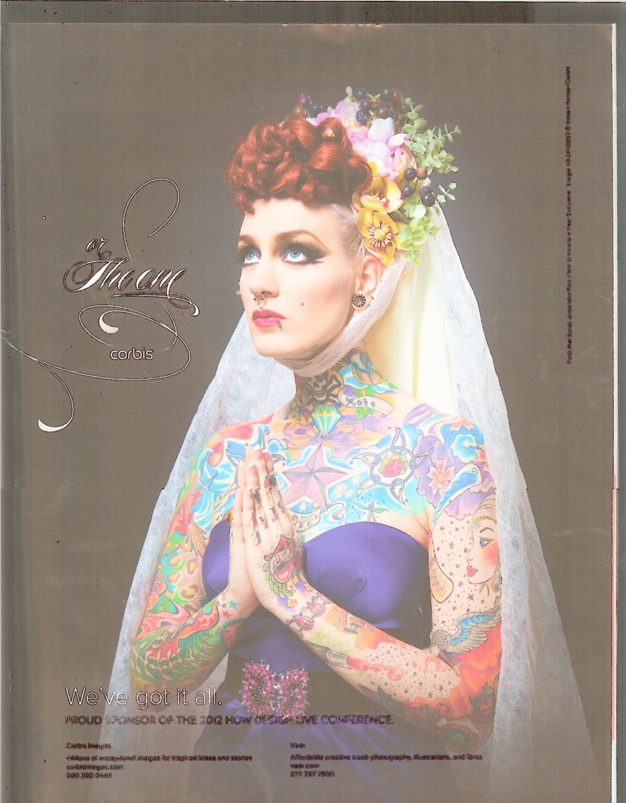
A Decorated Lady


These two images made up an ad as a two page spread. I was intrigued by how the ad got me to really look at each image to see the similarities and differences. Each piece is similar in a way but none are identical. Some things look authentically photographed and some elements look "photoshopped." I think the ad, which is for Corbis, is pretty effective. This ad was from How.